Making a logo is not a difficult process. However, there might be a lot of questions going through one’s mind when designing a perfect logo. If you also have a good deal of questions buzzing around your head and need some inspiration about the logo with letter F, then you are at the perfect place.
In this blog, I will be discussing a lot of the different types of logos that you can have as an inspiration. Seeing these you can design the perfect logo for you and use it as branding for your business. So, without any further ado, let’s jump in.
3D
These are some special types of logos that have all the 3 dimensions in it. This gives a better feeling to the clients and they get a feeling to browse in the store. Possibly they can also buy some products.

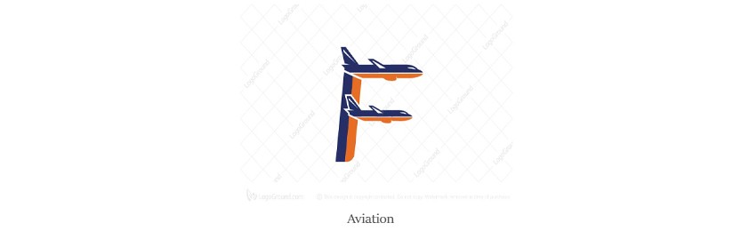
Aviation
This logo represents the aviation department. Here the logo has got two airplanes as the two lines of the letter F. This can be a great symbolization for any business which is related to aviation or anything related to airplanes. Thus, you can simply design a logo and start using it as your branding by taking inspiration from the above one.
Bricks Effect
This name is quite self-explanatory. As per the name of the logo you can understand that this has got something to do with bricks. You get further clarification when you have a look at the image that is attached below.
Alongside this, this is a quite popular logotype that you can use. You can add up your ideas with this and form something crazy and much more am

Bubble Effect
This name is also quite self-explanatory. Here you get a small design in the form of the bubble effect. This not only makes the logo quite attractive but also takes it to a new level.
You can judge this yourself by having a look at the logo above. This one is quite simple yet attractive. The bottom line is that this is the best option for simplicity lovers.
Hence, if you are also one of them, then you can start working on this right away. Why wait?

Color Combination
Are you a big fan of colors and are looking for a good combination with a perfect blend? If that is the case then you can have this logo as the best option for you.
The image here has got a good blend of colors along with a great combination. The overall aspects of the design make this one very attractive.

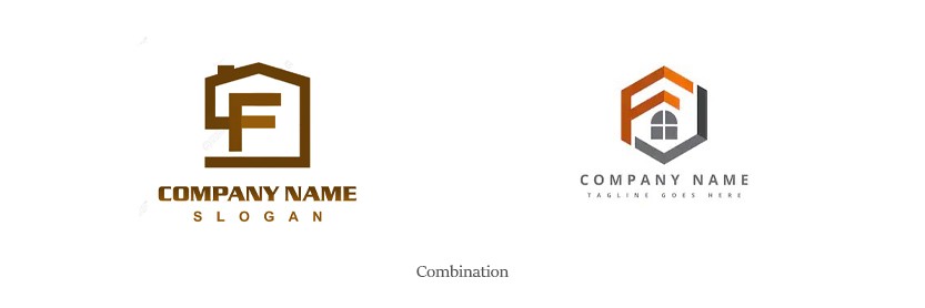
Combination with other letters
There are many instances where you cannot design your logo with one single letter. The reason may be that there are partners in the business and you need to add the first letter of the name of each member.
The other case may be that your company name consists of two words that you want to add the first letter of.
For both the cases, the thing that is in common is that you cannot have the logo with a single letter and you need to have a combination. For such scenarios, the combination of letters is very important. Now, you can make sure that there are pretty many uses of such types of logos.
Cursive Writing
There are times where the business owner wishes to have a logo that has the design of handwriting. This handwriting can also be of two types. One is that of the normal handwriting and the other one is the cursive one.
If you are also one of those who love a handwritten effect on their logo and that too in the cursive form, then you can surely try out this type. The image which is added below has the effect and you can see how it looks.
This type can be a sure shot for you.

Curvature
Curvature is a great effect to try. This is a simple logo but has an artistic touch on it. It not only grabs the attention of the client but also gives them a positive vibe about your store.
As a result, they get the desire to browse your shop, and if you can make any sales, that in turn earns you revenue.
Owing to that, you can try out this one and it is most likely that you are sure to get success. So, why not give that logo a try?

Dual Color
There are times when people do not want a lot of color combinations in their business logo or brand identification. They want to keep it simple and minimalistic. At most, they might want a mixture of two colors. For such scenarios, the picture added above is one of the best solutions. They can surely give you a simple and minimalistic logo that you want.
You can clearly see that there is only a combination of two basic colors. That gives this logo a simple yet attractive look.

If you are a big fan of the Facebook icon and want to have something similar in your logo as well, then you can give check the one attached below. The design is quite similar to that of Facebook yet there are differences.
You can also do further modifications to it and make it up to your choice. Hence, you should immediately jump in and start working on this.
Are you still struggling to get the perfect inspiration for you? If that is the case, then you should not worry. There is more to come in the way. Hence, let’s keep going.

Flipped
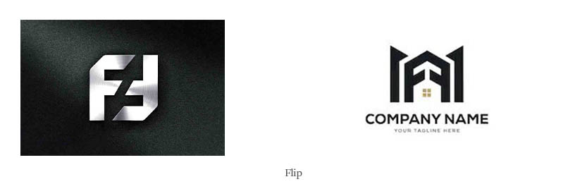
The flipped effect is also a quite popular one and is widely used. This can also be divided into two basic parts. One with a horizontal flip and the other with a vertical flip.
The one attached above is one with a horizontal flip. This also resembles a house. This shows that this logo is a good option for real estate companies. This can also be considered and used as a themed logo. This is a good mixture of both.
On the other hand, the one added below is the vertically flipped one. This is also quite attractive and works well.
Floral
Many people love flowers. They might prefer this sort of logo. Their reason is also quite simple. This is completely made of flowers. There might be another situation where this logo can be used widely. That is in any business which sells flowers.
Be it any big company or a small shop. This is one of the great options for them.

Initial
Initial is a specific type of logo which makes sure that there is only the first letter of the company used here as an initial. The name is quite self-explanatory. An image is also added below for reference.

Instrumental
Instrumental refers to the usage of an instrument. This ensures that there is a good scope for businesses who sell various instruments. An example could be a musical instrument. The image added also shows that the image has the theme of a musical instrument.

Inverted Triangle
An inverted triangle is when the entire letter F is in the form of a triangle that is inverted. This is a good option to use as well. This one is also widely used.

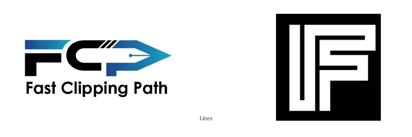
Lines
This type of logo is quite crucial. They are also quite trendy and hence used a lot. If you think this is one of those options for you and you should use such a logo, then go ahead. These logos are quite common and great to use.
Pixel Formation Effect
There are many people who love the pixel formation effect. Here it is shown that the image is being formed by the coagulation of many pixels.
This makes the logo look quite elegant and give it a great look.

Reflection
This type is quite similar to that of the flipped one. The difference is that here the reflection is a mirror image and there is an exact mapping.
Sparkle Effect
The sparkle effect is quite trendy and famous among young people. This effect gives a party vibe and is thus quite famous in people of a quite young age.

Superhero
Are you a fan of a superhero? Or is your business to sell showpieces or anything related to the Marvel superheroes? If that is the thing, then you can surely give this a try. So, you can start working on this logo and design your own one right away.

Themed
Themed logos are considered to contain the theme of the image of the theme of the business. As a result, this is one of the best ways to represent a brand and anyone, by looking at it can guess what this company is about.

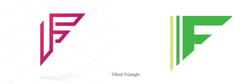
Titled Triangle
Here the letter F is in the form of a triangle and that too tilted. This might sound crazy but you will understand this very well when you look at the image that is given below.
Wavy
Over here, you get to see a wavy pattern in the letter F and that is then formed into a logo. This is quite simplistic yet quite attractive. The image below gives a very good demonstration.

Conclusion
In the blog above, I have shared a lot of logo ideas that I have come to know about working as a logo designer. You can try any of these whichever you like the best.
There is always the option to check and improvise and add custom designs to the ones you have read about above.
Hence, without any further ado, and without any waiting, you can choose which idea you liked the best and which one is the best one for your branding and start using it by making the necessary changes. That is how you can design your perfect logo with the letter F.

