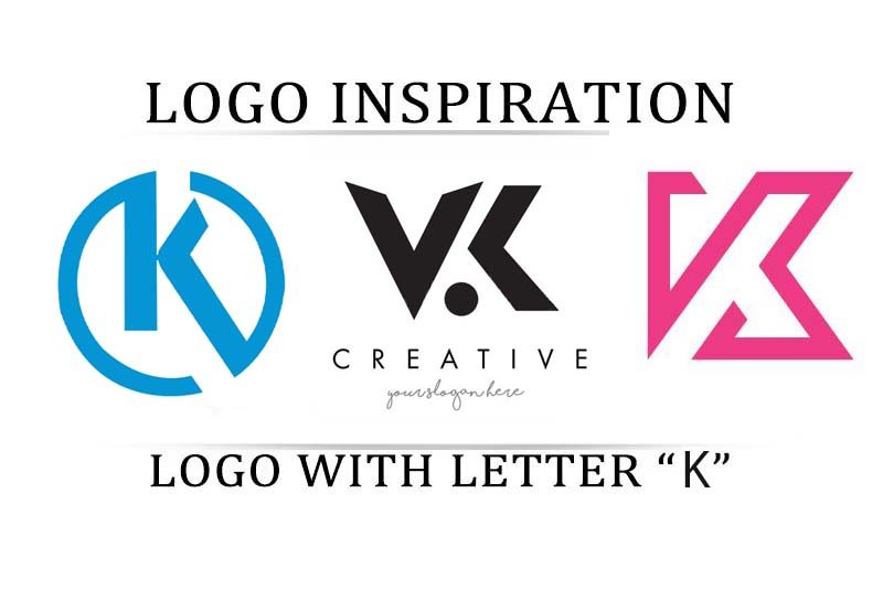
It is the desire of every business owner to have a logo enveloped with professionalism. For that, the logo has to be simple yet meaningful. It has to represent the brand to the fullest. Alongside this, it should be so attractive, that even if anyone sees it for once, it will get embossed in their minds.
Recent studies have shown that almost 85% of the leading brands’ designs only use one or at most, two-color tones in their logos. 95% of the top 100 brands use only one or two colors in their logo.
Hold your breath. That is not all. There are more.
It has been found out that there is approximately an increase of 80% in brand recognition. This is achieved when a colored logo design used. And from these, the top colors used by brands in their logos are blue (35%), red (23%), and grayscale (23%).
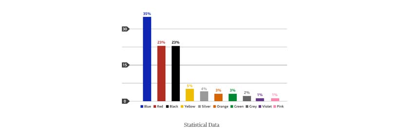
Studies have also revealed that when people make a subconscious judgment about any product or brand, almost 60% to 90% of that evaluation is based on color.
This is also the conclusion of many people from their business acumen.
Data source: Finances Online and Design Crowd.
However, it is not always possible to choose the best logo for the business. And it most cases, this happens because people run out of ideas. But fear no more. Today I am here to help you out. I will walk you through the different possible logo inspirations with the letter K.
Hence, without any further ado, let’s dive straight in.
Bubbles
This is one of the very attractive logo themes to comply with. It is quite simple, yet meaningful and represents the company at the same time.
As you can see in the example below, there is a combination of only two colors, pink and white. Yes, in the above it was written that the most preferred colors were red, blue, and black or grayscale, but not pink.
Yes, you are absolutely correct. This is fine but pink can also be used. It might not be the color that is used often, but it still gives a nice outlook to the logo here.

Circular Canvas
Another such attractive logotype is the circular canvas. What this means is that the logo has a circular outer boundary and on the inside, the logo K is either engraved or drawn or written.
This is the ultimate solution for people who want to have the letter K in their logo as an icon but also want the logo to be circular. Did not understand? Let me explain. The letter K is neither circular nor pretty much symmetrical. Hence, it is quite impossible for business owners to have it in a circular shape.
Thus, this type of circular canvas is considered to be a life saver.

Combination
The above scenario represented situations where people wanted to have the letter K as an icon in their logo. But what will happen to those people who need something more than K. This may be because of two basic reasons. First is that the company might have a two-word name. Or the second reason may be that there are two people as the stakeholders of the business.
So what to do in those cases? For them, the concept of combination is the best choice. You can see the example below. This represents the letter V along with the letter K.
If you have also got any such requirements, then you can try out the combination of two letters and try making your logo.

Creative Touch
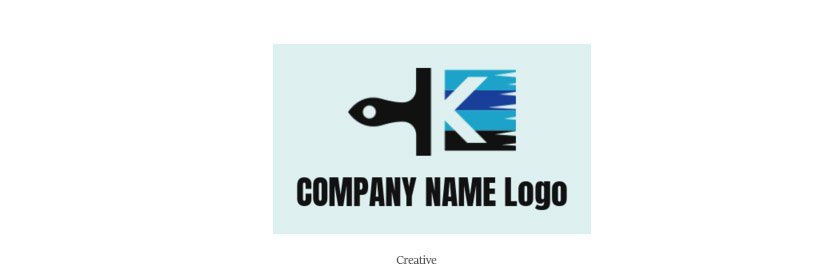
Creativity is very much needed to design and create a logo. And that creativity can also be used to replicate the business theme in the logo.
Let us consider the logo below, which is shown as an example. There you can see that the logo has the base of a paintbrush. This is the perfect sort of logo for any business selling paints and paintbrushes.
Also, that is the choice to go with, if you want your potential clients to understand what your business is about, just by looking at the logo.
Disjoint Lines
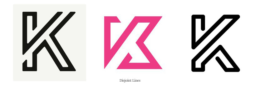
Disjoint lines are quite trendy nowadays. They resemble fashion and also the business theme in some cases. For example, businesses selling iron rods or iron bars can use such logo designs in their business.
So for such businesses, this is a must-try.
Engraved
Engraved is the special type of logo which has got the theme of the business engraved in it, just as its name suggests. As a result, these logos make it easy for customers to understand what the business is about.
The example above represents shows that the face of a human is engraved on the right-hand side of the logo. This is how this concept of logo works.

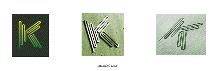
Entangled lines with loops
This is another logo type that can be used by different businesses.This is quite similar to that of the disjoint lines one. However, minute differences are there.
Let me give you an example of the key differences. The lines here have bends and the bendings are quite curvy and not straight lines.
On the other hand, in the case of disjoint lines, the lines had pointed vertices when there were bends.
Parallel Lines
This is another sort of a design comprising of lines. This design makes the logo look quite attractive and classy. They tend to make the logo look elegant. You can check the image below to have a better understanding.

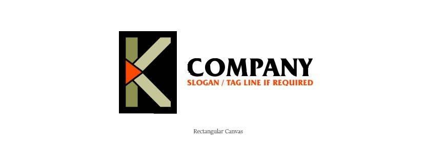
Rectangular canvas
Rectangular canvas is quite similar to that of a circular canvas. The only difference is that in the case of the circular canvas is the outer canvas is in the shape of a circle, which is a rectangle in the case of a rectangular canvas.
Shape Combination
In the above, I have discussed logo design ideas with a combination of letters. However, that is not the only choice if the option is to go with a combination.
If you are planning to use the idea of combination, then you can certainly try this one out as well. This is a combination of different shapes this time. In the image below, you can see that the logo has the shape of the letter K in it.

Triangular Canvas
Last but not the least, the triangular canvas is a great choice as well. This is quite similar to the circular canvas and rectangular canvas. Here the outer canvas is in a triangular shape. As a result, this gives the logo a new touch.
And people who want to have some sort of triangular pattern in their logo, this is the option for them.

Conclusion
That was all I had for the day. I have tried to share all the different logo inspirations that I had with me using the letter K. There may be more as all you need to figure out more is to image it. And there are no restrictions to imagination.
If you have got anything else to share, then please let us know in the comments below. Till then, keep experimenting with all the different types of logo inspirations with the letter K.

