Today is going to be real fun. I am going to share with you, some of my experiences that I have gathered throughout the years.
By now, you are quite familiar with several companies out there that have got a name starting with the letter P. But you might be wondering that what is the big deal in that? Yes, that is something quite obvious. But the big deal lies in finding a proper logo with the letter P to symbolize the business.
And, if you are reading this blog and you are looking for some logo inspiration with the letter P, then this is the perfect place for you. This is because I am going to be compressing all of my knowledge that I have gathered throughout these years, into this one single blog.
So, what is the wait for? Let’s dig right into it.
First of all, what I would like to mention is that logos should be as simple as possible. Fancy logos with a lot of things forcefully compressed together does no good to any business in any way.
Want solid proof?
Here you go. The world-famous tech giant, Apple has a simple logo which is an apple itself. But the cost to make it was 50 grand. Data source: creativebloq.com. And you can imagine the power of this logo. Not only simplicity. It has got great meaning as well.
The part of the apple that is not visible on the logo was considered to be a bite taken. Then, ‘bite’ got transformed to ‘byte’. And byte refers to a small amount of data in the world of computer science. And from there emerged the logo which still exists.
Not only tech giant apple. Think about other tech giants such as Microsoft. Their logo is only four squares. Facebook. Only the letter f. Pinterest, with only the letter P.
Do you realize it now? How much value simplicity has got?
So let’s now check out our first logo type.
Circular Canvas
This is one that resembles simplicity in all aspects. No matter whatever your logo idea is, everything will be enclosed in a single circle.
For a better understanding, you can have a look at the logo below which is used as an example.

Here you can see that the letter P, the theme of our blog today, is enclosed in a circle.
Combination
A combination can be of several different types. However, in this piece of writing, I will demonstrate only two, to keep things simple.
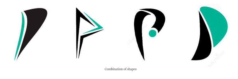
Combination of shapes
A combination of shapes means multiple shapes are combined together to form what is needed. Here in our case, we need to form a P with a combination of multiple shapes. You can consider referring to the image below which has been added as an example.

Combination of numbers and letters
Another sort of combination that I am going to discuss is the combination of numbers with letters.

You can refer to the image above to understand better. As you can see here that the base is the number 1. Inside that on the left line, the curved part is added to form the letter P. As a result, we get this combination of numbers and letters.
Dispersion
If your business is related to multimedia, then you have this as your perfect solution.
Why? Let’s understand.
As you can see in the image below, this is being, whichever you consider, either faded away or gathered together, in the form of pixels. And for multimedia companies, what can be more crucial than the use of pixels?

Tired of inspirations of single colors? Want something with a combination of two colors? Then think no more. The next one is exactly what you are looking for.
Combination of colors
Similar to the other couple of combinations that I have mentioned above, this is another one. A combination of colors. Here you can see that the upper part of the letter P is red and the lower part has some dark shade of gray.

Engraved
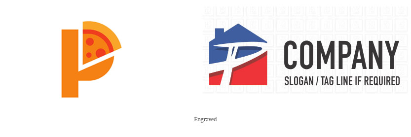
What do we refer to as engraved? Engraved means that we have the business theme embossed in the business logo. Let me walk you through an example.

In the diagrams above you can see that the business theme is there. Let’s consider the first one. In the curved portion of the letter P, you can see that a slice of pizza has been inserted. It can be inferred from here that it is the logo of some sort of food court or pizza store.
On the second one, the letter P has the background of the building, from which we can understand that it is related to some sort of a real estate business.
Resemble famous logos
If you love simplicity very much and want to stick to the styles and designs of the celeb and famous world-recognized brands, then who is stopping you. You can have something similar to that of Pinterest.

Lines
Having basic simple lines in your graph is something that is quite good to have. This is because, it makes your logo quite plain, yet attractive.

Consider the logo above. All it has got is a single line with a number of turns and curves. And what do we have as the end result? A beautiful looking logo. What else is needed?
Multiple lines
The above one was a single line bent to form P. This is another one. However, unlike the one above, it has got multiple lines. And guess what, this also creates another design and makes the thing look better.

Motion
Do you own an automobile company? Then you can give this design a thought. Why? This is because it has got a symbolization of motion in it.
By seeing this logo, even a child will understand that this has got something to do with speed and movement.

Themed
Themed logos are quite similar to engraved ones. They have also got the business theme in them as in the image below. Here you see a beautiful flower is drawn by a spiral line. Simple yet pretty.

Conclusion
These were all I had with me in my collection today. I hope you have got amazing logo inspirations with the letter P from this article and can now design your own marvelous logo without any trouble.
For next up, We are planning to start another logo idea series with roman numerals.
Also, if you have got any better suggestions or any other logo inspirations that are worth mentioning, please hit me up in the comment section.
Till then, take care and wish you all the best for your new logo.

