Who does not want a professional logo for their business? No doubt, this is a colossal hobby of every businessman. Moreover, it is often seen that many businessmen struggle to find the best logo design idea for their business.
Are you also one of those people? Then take a deep breath and relax. Today, I am going to share some amazing logo inspirations that will blow your mind. You will then be floating in a stream of logo designs and will have a lot of options to choose from.
Hence, without any further ado, lets jump in.
Bubble Effect
If you are opting in for a great trendy looking logo but have got no idea on what to do, then this is an option you can definitely go with. This design is not only trendy but also sleek and elegant.

Chili Themed
Chili themed logo, as you can see in the image below, can be used to represent the theme of food and drinks. In simple words, this is a great option for hotel and restaurant owners. The reason behind this is that, right after looking at the logo, even for the first time, any potential customer will be able to understand what this business is all about.

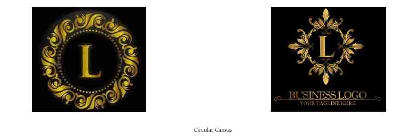
Circular Canvas
Yes, I do understand that you want a logo in the shape of the letter L. At the same time, you also want to have it in the shape of a circle. And here comes in the pain. The letter L is not in the shape of a circle. Not even close.
So what can be done? Is there no solution to this?
Hold on and relax. There is of course a solution to this. And the solution is the design of a circular canvas. And if you think that you need some demonstration of how it would look, then I have your back. I have attached two images for your reference.

Cursive
Another trendy and modern logo design type is the writing of the letter in cursive handwriting. Yes, in today’s era of modernization, we definitely rely on computer technology. But why is the handwritten style so trendy at the moment then?
The answer to this is right there sitting in the question itself.
Let me split it into two parts.
First of all, the cursive handwritten design is quite famous because all we have today is done by the aid of a computer with some sort of a robotic font. This handwritten style brings in a variation.

Secondly, the logo, even though has got a handwritten style, is still done using a computer. Only, the font is quite different.
Secondly, the logo, even though has got a handwritten style, is still done using a computer. Only, the font is quite different.
Disjoint Lines
Logos with disjoint line(s) is a form of the logo where we make a design with either a single line or by using multiple lines and they are not joined. This means that the end of the line is not joined to the beginning of the line after the shape making is complete.
You can see the image above as your reference, which might be helpful for you to understand better.

Dispersion Effect
The dispersion effect is quite similar to the droplet effect. However, they are not exactly the same. Are you interested in knowing the key differences in them? Then you can have a look at the image below and then compare it with the image of the droplet effect at the top. All of your confusion will be clear.

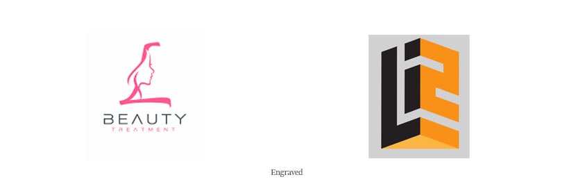
Engraved
The engraved logo means that it has got the theme of the business engraved in it. As a result, it becomes easier for customers to understand what the shop is selling. Hence, your business will get fueled by customers.
Let’s consider an example. In the second image below, there is the face of a lady engraved in it. From this, we can assume that this logo might belong to some sort of a parlor. See, how simple the process is.

Nature
Are you a big fan of nature?
If the answer to that question is a big yes, then I have got the ultimate option for you.
The image above has got the shape L drawn by bamboos. This represents quite a few things. First of all, it represents nature, which is a positive side for all nature lovers. Second, it may sometimes be possible to guess about the business, if it uses some similar sort of logo.
Still, you did not find what you were looking for? Do you need more inspiration? Then sit back tight as there are more to come.

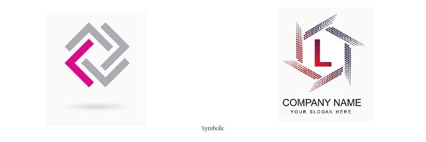
Symbolic
There are many people who want their logo to be in the shape of a letter. On the other hand, there are people, who do not want it that way. Yes, they do want it with the letter L, but not in the shape of it.
They prefer having some sort of symbolization.
As you can see in the example above, a square shape is formed by making different combinations of the letter L and that too in different orientations. You can surely try this out.

Themed Logo
Every business has got a theme in itself. Also, the theme is quite important for the customers as it will inject more sales and help in generating more revenue.
As shown in the example here, the theme is needle and thread. This then becomes easy for even a baby to understand what the deal is about.

Conclusion
Here are all the logo inspirations with the letter L that I had to share with you today. Which one did you like the most? Also, is there any other inspiration that you think is a great option? Then please let us know in the comment section.
Till then, keep browsing the different logo inspiration with the letter L.

