If you consider the process of designing to be quite difficult then you are not entirely wrong. When I first started my career as a logo designer, I also faced a lot of difficulties.
However, as time went by, I came to know that if there were some places where you could take inspiration from, then the entire process can be much easier.
Owing to that, today I am here with a lot of logo inspirations with the letter G. Let’s jump in right away so that you can quickly find out the perfect logo for your brand.
Arrow
Here you can see that the logo is designed with the theme of an arrow. This can be a great idea for you as well. Thus, you can take this idea, make some necessary changes, and start working on your branding.

Bubble Effect
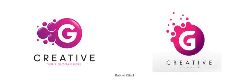
The bubble effect is one you should definitely try. Here the image usually has a bubble effect. The logo seems to be formed from a bubble or may seem to disappear in the form of bubbles.
The first image shows the formation by bubbles and the second image shows the disappearing.
Business Progress Graph
The business progress graph is quite common in the marketing and consultancy business. They are used to show how the business is doing at the present time in comparison to the past.
Do you also need something similar? If so, then you can also choose this logo and have something similar. This logo has the potential to bring in a lot of clients to your business.
The more clients in the business, the more there is a chance to earn some revenue. So do not wait much!

Colorful
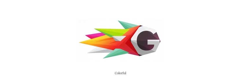
It is often seen that some people want their brand logo to be a colorful one. This one is the perfect option for them. The image below shows that this logo has got the perfect blend of colors in it and looks very much lively.
Combination
There are many logos that are usually a combination of many things. Today, I will be discussing those. Today we will get to know about the following types.
G with other things
In the image below, it can be seen that the letter G has something in combination with it. It is a particular type of symbol that has been used to match.

G with numbers
Now, the letter G has got some numbers with it. This is because there are some brands whose names have got both letters and numbers. As a result, their logos need to be a combination of both of them.
For such businesses, this is an ideal type of logo. They can use something similar, without any hesitation. Alongside this, they are getting the opportunity to represent their entire name in the logo.
That is not all. There is another type left. Let’s know about that as well.

G and some other letters
At times, the name of a certain company can be of two or more names. This logotype is a good option in such cases.
Not only that. There are times when the name of the company is only one letter but the owner of the business wants to make sure that there is more than one single letter in the logo.
These are two scenarios where such logos can be used.

Creative
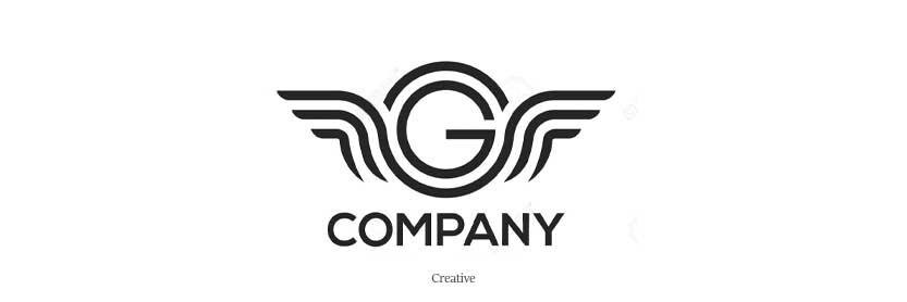
Creativity is of great importance in any sector. Without creativity, it is difficult to have a great result. There are creative logos as well. The image below gives a good demonstration.
Curvature
There are many logos that simply consists of nothing but curves. Attached below is an example. You can have a look at that to get an idea.
Such logos can be quite simple but this does not mean that there are ugly or unattractive. They tend to be quite attractive and serve the purpose.

Droplet
The droplet effect is quite simple yet quite attractive. They are quite common nowadays. You can have a look at the logo below which I have added for demonstration purposes.
Here the letter G is a bit angled and formed in the shape of a droplet. This gives this a water droplet effect.

Engraved
Engraved means, as the name suggests, the theme of the business is engraved in the logo. The logo should contain the theme no matter whatever that is.

The engraved logo that is used here as an example has the theme of a house. This means that this can be used for real estate businesses. Anyone, just by looking at it can say what the business is about.
Such logos results in bringing in many more clients to the business and make sure that you have more sales.
Floral
Some people like flowery logos. For them, this is a perfect idea. You can see that the image attached herewith has got a floral effect. It is designed to have such flowers. If you have got a store where you sell flowers, that you can use this logo. By seeing at such a logo, anyone can understand that you sell flowers. The logo itself is sufficient to convey the message.

Gaming
Are you a great fan of gaming? Or have you got a business where you sell or prepare game-related items? If the scenario is like that, then you can surely opt-in for such logos. They are very much responsible for bringing in clients to the business and make sure that there is enough turnover for the business.
Gears
If you produce mechanical spare parts or gears this is a must-try option for you. Such logos clearly convey that the shop has got something to do with mechanical parts or gears. Such logos are pretty self-explanatory.

Geometric Construction
In this logotype, it can be clearly seen that the logo is draw using the geometrical construction which we have learned in middle school. Such logos can be used by people or businesses preparing and selling school geometrical instruments.

Gym
The logo below shows the letter G with a muscular hand inside. This clearly shows that this logo can be used in any gym.
Incomplete Lines
Logos formed by incomplete lines are quite trendy these days. The name is quite self-explanatory. It means that the logo is formed by lines that are not complete or have no end or closing. They tend to stop all of a sudden.

Inverted
The logo here contains an inverted reflection of the letter G. This has not got enough work or some tough detailing in it. The logo is quite simple but has good use in the recent market.
Laboratory
Here the logo is designed by a bent test tube. By this, we get the feeling of a science lab. For businesses selling such scientific equipment, this is a great option.

Nature
If you love nature, then you can surely give this logo a try and see how this works for you.

Partial
Over here, the letter G is in a partial form. You can see in the image that only half of the letter G is visible. On the other half, some other thing is written. For example, there can be the name of the company.

Pixellated
This logo has the effect of being formed by the coagulation of pixels. This is quite attractive and a lot of the business in today’s market uses them.

Plain
There may be times when your client may demand something quite simple and normal. In such cases, such logos are found to have great use. You can rest assured that using such a logo can be great.

Repetition
This time, you get a repetition of the letter G in it. These are common in companies that have got two names both starting with the same letter.

Segmented
The logotype below has got the letter G segmented into four major parts. This can be done with logos of any type. Any shape can be divided into four major segments.
Are you tired of looking at all the logos with capital Gs? Want something different? Then let’s jump straight into it.

Small g
Here the logo is made out of small g. Engraved in it, there is a nice looking butterfly. This gives the logo an elegant look.

Superstore Cart
Superstore Cart, as its name suggests, has got the superstar theme engraved on it. This is a great option for superstores.
TikTok
TikTok is quite trendy in some regions nowadays. If you also belong from there and also like it, then you should surely use this one.

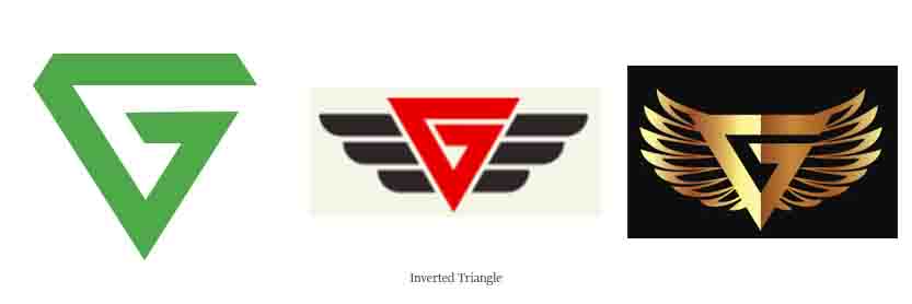
Inverted Triangle
For such cases, the entire letter G is made into the shape of a triangle and it is upside down. This inverted effect gives the logo a great look and makes it appealing.
With Object Inside
Here comes the one which is quite different from the rest. Most of the above had a canvas of the object and then inside them, the letter G was present.
However, here that is the entire opposite. You get a different feeling. The canvas here is the outline of the letter G and on the inside, there is the drawing of an object.

Conclusion
This brings me to the end of the blog today. In the entire blog I have tried to share logo inspirations with you so that you can get ideas from there and design your own logos. However, there is something to bear in mind. All that is shared here are simply ideas.
Do not forget to make the necessary changes to them as per your brand and make sure to have an amazing logo with the letter G.

