Recent studies have found that only 5 out of every 100 people can design amazing logos with a little bit of inspiration. Are you also one of them? If you are, then you have landed in the perfect place as today I am going to be your guide on a tour of discovering amazing logos with the letter O.
It has been also found that the best logos are obtained one has an idea of oneself and has also got some sort of a guide. That makes the perfect combo. And the best thing is that we are also going to experience that now.
So let’s begin.
Bubble
First and foremost, I have got the bubble design for you to make an amazing logo for your company. This bubble design looks quite classy and has not got any clumsy detailing in it.
And what is the result then? You get a sleek and clean logo for representing your brand identity.
You can have a look at the image below for reference.

Combination
There are people who love a lot of combinations in everything, be it their business logo or anything else to be used in their day to day life.
The next two types are for them. These contain two different types of combinations. First is a combination of colors and the other one is a combination of letters.
Let us check out the combination of colors first.
Combination of colors
The name combination of colors is pretty self-explanatory. By looking at the name, anyone can understand that this has got something to do with the combination of colors.
Moreover, here one gets the opportunity to add a lot of colors to their design. Especially, the colors they either like the most or consider to be the color of their business theme.
As you can see in the logo above, this logo consists of three different and distinct colors, namely yellow, pink, and green. Also, if you notice carefully, you will get a silver border around the edges.
After having a close look at all of these features, if you consider that this is a great option for you, then you can surely try this out.
Now let us have a look at the other option, which is a combination of letters.

Combination of letters
A combination of letters is useful when you are planning to put in two letters from your business name into your logo.
Such logos might seem to be quite complex when thought of. But trust me, when you will finally have the output in your hands, then you will see how simple this can be.
For example, let us consider the one below.
Here you can see that the logo basically consists of the letter O but it also has got the letter R emerging from its center.

Double Pattern
Double Pattern logos are quite similar to those of combination. It is basically a combination of two different patterns. At the end of the day, they are all under the same umbrella.
You can refer to the image above. There you can see that the left side of the logo has got a solid black color. And on the right, you will find that there are designs made out of stripes.
Pro Tip: You can try and interchange the position of the solid color and the stripes and see how they look. Also, you can consider trying to add more patterns here.

Engraved
Engraved means the logo will have the theme or the main objective of the business embossed in it.
Let’s try to understand this with an example.
In the logo above, you can see that there is the structure of a building. This gives us the impression that the company might be some sort of a real estate company or anything similar.
By anything similar, I mean the supplier of raw materials.

Line Patterns
Any design consisting of line patterns can also be considered to be under the roof of combinations. Hence, you will also find a lot of options available here as well.
As you can see in the example above, the letter O is designed using two different line patterns. Hence the name.

Orbital
We all know that some of the planets in our solar system have got orbits around it. If you love that, then you can also try this option out.
You can have a look at the image below for reference.

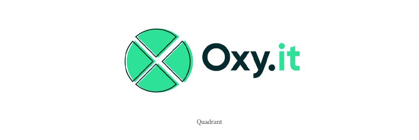
Quadrant
This design is quite useful for pizza sellers. Here, the logo consists of quadrants, which you can also consider as pizza slices.
You can also have a detailed understanding by looking at the figure above.
Spiral
This design consists of spirals all around and makes the thing simple to comprehend. Logo designs of this sort are usually quite common in companies selling electronic or tech-related products.
From the picture above, you can see how simple the logo design is.

Themed
This is quite similar to that of the engraved design. What this design specifically means is that you can surely have a lot of customers if you can market properly.
And you will be glad to know that half of the marketing is done by the logo itself. This is because by seeing the logo one can understand what the business is about.

Conclusion
In this blog, I have shown you the different types of logo inspirations possible with the letter O. These are quite trendy. There is a lot here but not all.
You can also browse the internet to add to what I have shown here.
Wish you very good luck on your journey to design a great logo out of the letter O.