Have you ever thought about how much importance a great logo has to represent a business? Well, I am pretty sure you did and have surely understood its importance. Now, if you are searching for a good logo inspiration with all the alphabetical letters, I have published articles regarding logos derived from all the letters between A to H.
So, if you haven’t checked them out, make sure you definitely do, who knows you may find out even more brilliant ideas.
Since we are done with A to H, today I will be sharing with you ideas about how to design the perfect logo with the letter I. So, let’s begin.
Basic
A basic logo is one with not too many designs or colorings in it. It has got a simple design with a clear conveying meaning. In addition to that, there are many people who prefer sobriety. For them, it is a must-try.

Candle
You can see in the image added below, that the letter I is in the shape and form of a lighted candle. This stands as a symbolization for hope and good luck. If you want anything similar, or like this thing or your business has got some relation to it, then you can surely try this out.

Creative and Elegant
A creative and elegant logo is what a lot of people choose to have. The reason behind this is that they do not have any clumsiness and make it easier for the clients to understand the meaning of the logo.
As a result, these types of logos have become quite trendy and demanding in the current market. Thus, they are great options to be tried out.

Double I
All the logos above had single I in them. However, if your search is different and you need one with a double I, then this one’s for you.
Here as you can see in the image that the logo is designed to have a circular or oval shape by the combination of two small letters I. This not only enhances the look but also makes your clients have positive thinking about your business.

Oval Canvas
This one is quite different from the rest. In the above ones, everything was centered along with the letter I. However, here everything is based on the oval canvas. Inside it, the letter I is engraved.

Pixelated
The pixelated effect is quite trendy among the people these days. This gives a very soothing feel. Here, the scenario can be described in two different ways. One is that the logo I is being formed by the coagulation of pixels, and on the other hand, it can be considered that the letter I is fading away in the form of pixels. If you also like this, then you should surely give this one a try.
All the letters above were mentioned with the letter I in its capital form. If you don’t want that and need something with the small letter i, then I have something for you. Please have a look at the next one.

Small letter i
This small letter i can be used as a logo in many other forms as well. It can also be considered to be a split one.

Split parts
The split parts logo is quite trendy nowadays. This consists of the letter I split into several small parts that are placed together to form the letter and in turn the logo.
If you find this one to be a great idea for your business, then this is a great option for you to try out.

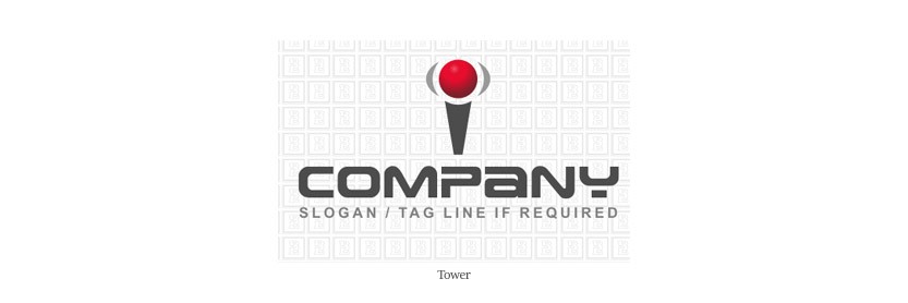
Tower
The tower idea can also be considered to be something similar to the joystick of a gamepad. If you have got any store selling games or gaming consoles, then this one is a must-try for you.
Conclusion
Throughout the blog, I have tried to share with you some amazing logo inspirations which might be a great idea for you and your business. I hope that you have got the idea to design your amazing logo and will surely have an outstanding logo with the letter I. I will be coming up with the logo inspirations with the remaining letters as well. CHEERS !!!